Your Eyes Deserve Better
It's 11pm. You're checking how your latest campaign is performing — link clicks, conversions, traffic sources. The dashboard is blazing white against a dark room. You squint. You lower the brightness. You close the tab earlier than you planned.
This happens to your users every single day. And it's entirely preventable.
Dark mode isn't a trend or a novelty. It's become one of the clearest signals a product can send: we thought about you, not just about how we look.
See the Difference for Yourself
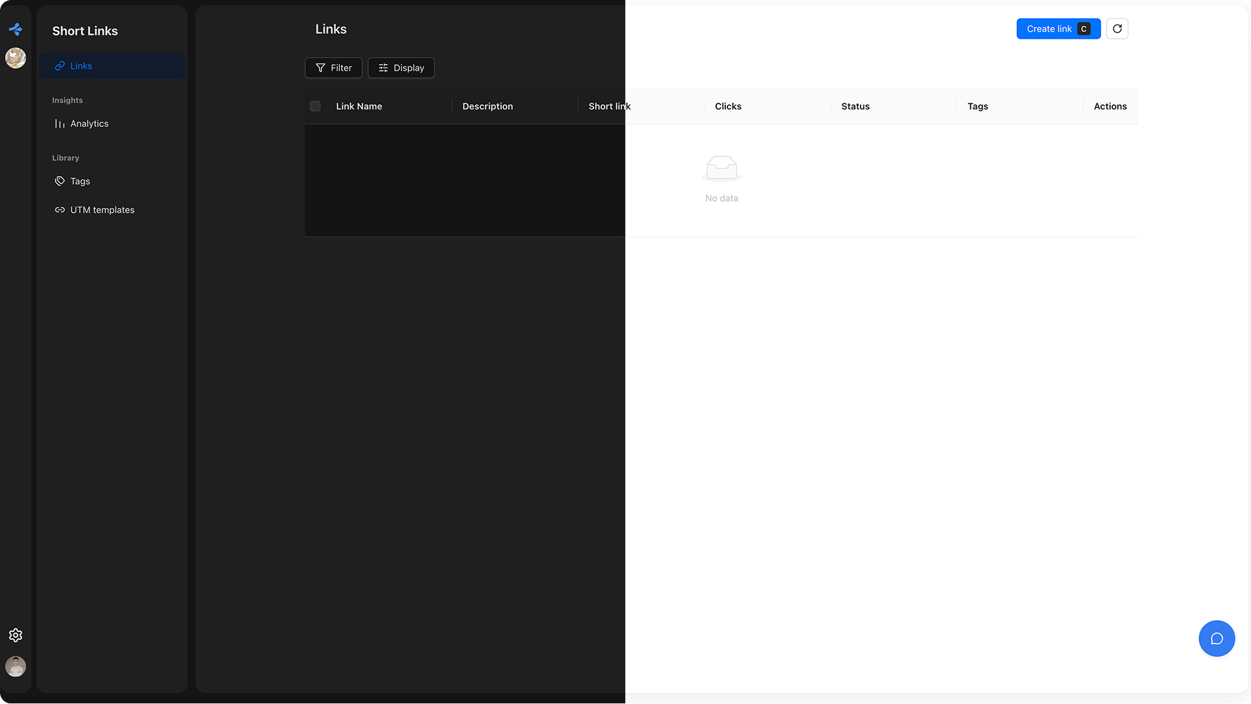
Drag the slider to compare how the same interface feels in light and dark.
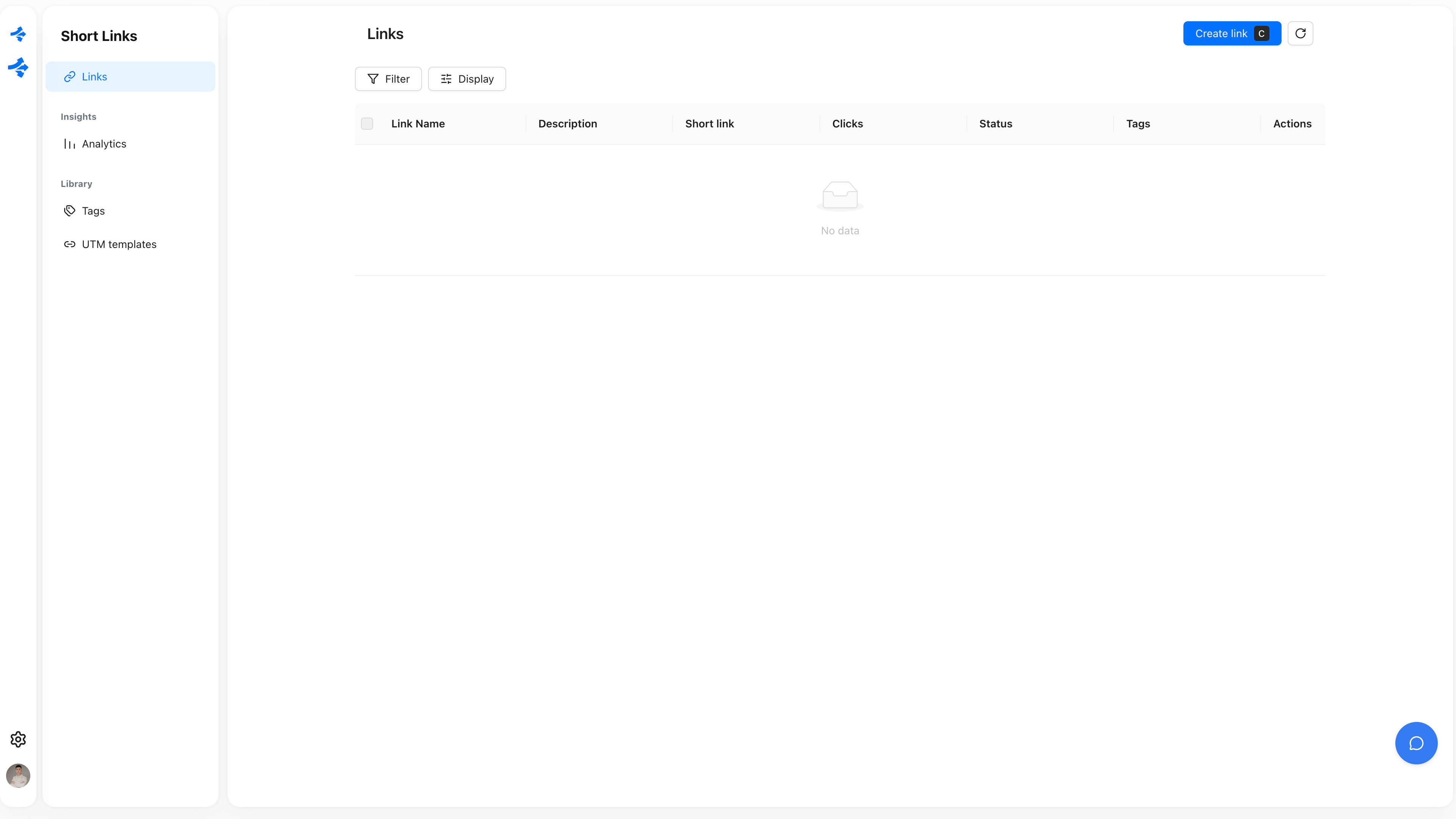
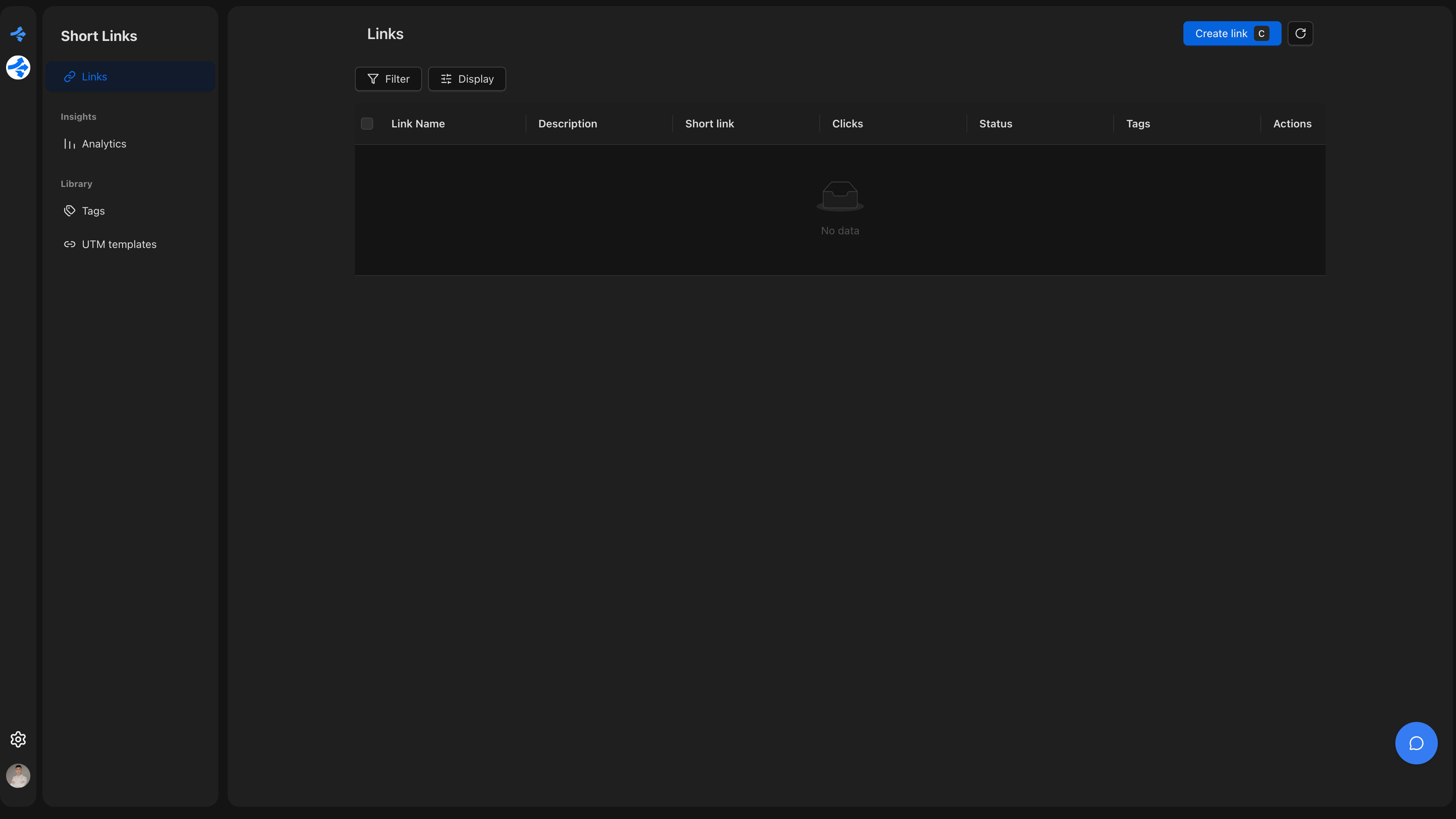
Drag to compare light and dark
Why Users Actually Love It
Comfort That Keeps People Coming Back
Bright screens in dark environments cause real physical discomfort. Eyes water, focus drifts, sessions end earlier. Dark mode removes that friction entirely — and users notice. When your product is comfortable to use at midnight, people use it more. It's that straightforward.
This isn't anecdotal. Studies consistently show that users prefer dark interfaces for extended sessions. For analytics dashboards, link management tools, or any product people check repeatedly throughout the day, comfort directly translates to retention.
Battery Life That Earns Loyalty
On modern smartphones — and most phones today have OLED screens — dark pixels use almost no power. A product with a thoughtful dark mode can save users 40–60% of screen battery compared to a bright interface. That's something users feel, even if they don't consciously track it.
When your app doesn't drain someone's battery on the commute, that's a small moment of goodwill that compounds over time. It's the kind of thing people mention when they recommend a product to a colleague.
Accessibility Isn't Optional Anymore
For many people, dark mode isn't a preference — it's a necessity. Users with migraines, light sensitivity, or certain visual conditions depend on low-brightness interfaces to use software at all. A product without dark mode is a product that excludes them entirely.
Beyond the ethical dimension, accessibility is increasingly a business expectation. Enterprise buyers check for it. App stores surface it. Users talk about it in reviews. Offering dark mode — and doing it well — signals that your product is built for everyone, not just the average case.
It Signals That You Care About Details
There's a psychological effect at play when a product matches your system preferences automatically. It feels like the software knows you. That feeling — even when it's just a color scheme — builds trust.
When dark mode is absent, users notice. Not always consciously, but the friction is there. The brightness jarring at 10pm. The white flash when switching tabs. These micro-moments erode the sense that a product is polished. Dark mode done right eliminates all of them.
The Standard Has Changed
Dark mode used to be a bonus feature. Something you'd add if you had extra time after shipping the real priorities. That window has closed.
In 2026, the majority of users have dark mode enabled at the OS level. They expect the products they use to respect that choice. When a product doesn't, it doesn't feel neutral — it feels like an oversight. And oversights, however small, are what users remember when they're deciding whether to recommend something or switch to something else.
The best products aren't just functional. They're considerate. Dark mode is one of the clearest, most visible ways to show that consideration.
Revolink Now Supports Dark Mode
Dark mode is live in Revolink. Switch themes from your profile settings — the interface adapts immediately, and your preference is saved. Whether you're setting up a campaign at your desk in the morning or checking link performance on your phone before bed, you can now work in the environment that's most comfortable for you.
Because link management shouldn't come with eye strain as a side effect.
Related Topics:

Maksym Yaroshchuk
Founder & CEO at Revolink. Writes about link management, marketing automation, and growth strategies.